Part B of the Lilla Rogers class, Make Art That Sells, is starting this Monday and I have a confession to make: I realized the other day that I was dreading it.
Uh what?
Yep, you read that correctly.
At some point during the last half of Part A I had let comparison, and subsequently shame, get the best of me. In the beginning, I was so excited to start the class and had decided that I would use it to really do some creative stretching! I would try new techniques, different styles-- experiment! All things I don't consciously do with my art work on a regular basis. Sounds fabulous, right? And it was. Mostly.
So here's the thing with experiments: often times they fail. You try something and it just doesn't work for whatever reason. But almost always the failures lead you down a path you wouldn't have found otherwise. Which leads to growth, aka the whole point of experimenting in the first place.

Know what is really not helpful while experimenting? Comparing your work to other people's, never mind a bunch of really talented artists. And I'm embarrassed to admit it, because I consider it such a rookie move, but I totally fell into that. In general, comparison can be pretty deadly to creativity, but it felt even more so combined with the growing and stretching I was trying to do. Instead of inspired by my fellow classmates, I just felt not good enough. Instead of having fun and playing and trying new things, I got nervous and tentative. I was not so nice to myself. Doesn't someone compare your inner artist to a child? (Is that from The Artists Way?) Well, I was total jerk to that kid. And forget about discovering any new paths through my hard won experimenting. It became too scary, too uncertain.
I should note that all this was sort of kicking around under the surface. I knew something wasn't quite right, but I couldn't put my finger on it. The class, (which is great,) moved at a fast pace, packed with information and I scrambled to keep up, confused as to why it seemed like it was getting harder and harder to do so.
And then it ended and I breathed a sigh of guilty relief.

Fast forward to last week, when my fellow classmates all started bubbling with excitement over the impending beginning of Part B. It couldn't come soon enough for them! Meanwhile I was using words like "impending" and maybe "looming" when I thought about it. And I was ashamed to feel that way. What was wrong with me? Why am I being so lame? As a creative person, this should be like unlimited ice cream sundaes for five weeks. And instead, I'm dreading it?? WTF, Gaia?
In a burst of synchronicity the universe swooped in and offered some guidance. Fellow classmate, Cheryl Bakke Martin, posted
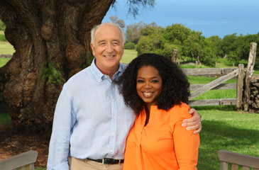
Oprah's interview with Steven Pressfield. He wrote
The War of Art, which is one of my favorite books. One that I recommend to everyone, I have a much loved and dog eared copy. Though apparently, I hadn't picked it up in a while, because I kept having "Aha moments," as Oprah likes to say.
Pressfield starts by defining Resistance:
"Resistance is the negative force that arises whenever we try to move from a lower level to a higher level. When we're trying to identify with our nobler nature. --Our higher nature."
And then Oprah mentions the list of activities he compiled that commonly elicit Resistance. Number 1 is "The pursuit of any calling in writing, painting, music, film, dance, or creative art, however marginal or unconventional."
Oh yeah...
[ted id=1042]
And then, because I can be a stubborn person who needs things hammered home, what book should be prominently displayed at my local library? Brene Brown's
Daring Greatly. (You might know her from TED talks, like the one above.) The book opens with a passage from Theodore Roosevelt's speech, "The Man in the Arena":
It is not the critic who counts; not the man who points out how the strong man stumbles, or where the doer of deeds could have done them better.
The credit belongs to the man who is actually in the arena, whose face is marred by dust and sweat and blood; who strives valiantly; who errs, who comes short again and again,
because there is no effort without error and shortcoming; but who does actually strive to do the deeds; who knows great enthusiasms, the great devotions; who spends himself in a worthy cause;
who at the best knows in the end the triumph of high achievement, and who at the worst, if he fails, at least fails while daring greatly...
And then Brown says:
"...Vulnerability is not knowing victory or defeat, it's understanding the necessity of both; it's engaging. It's being all in."
"...Our willingness to own and engage with our vulnerability determines the depth of our courage and the clarity of our purpose; the level to which we protect ourselves from being vulnerable is a measure of our fear and disconnection."
I put the book down and was like, "Ok. I get it!"
I share all this in the hopes that it will find some reader out there who is struggling with the same stifling thoughts and heavy self doubt. I hear ya. But I'm happy to report that after a kick in the pants from Pressfield and Brown, I'm raring to go! Dare I even say, Bring it on.
And to my fellow classmates, who are continuing on this journey with me, let us be brave and vulnerable explorers together. I can't wait.
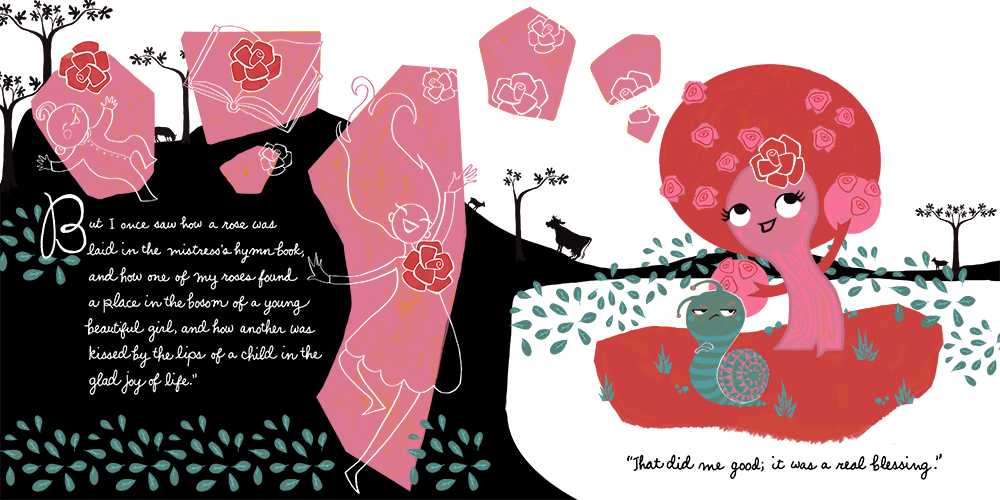
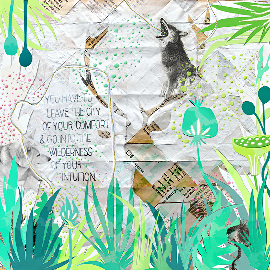
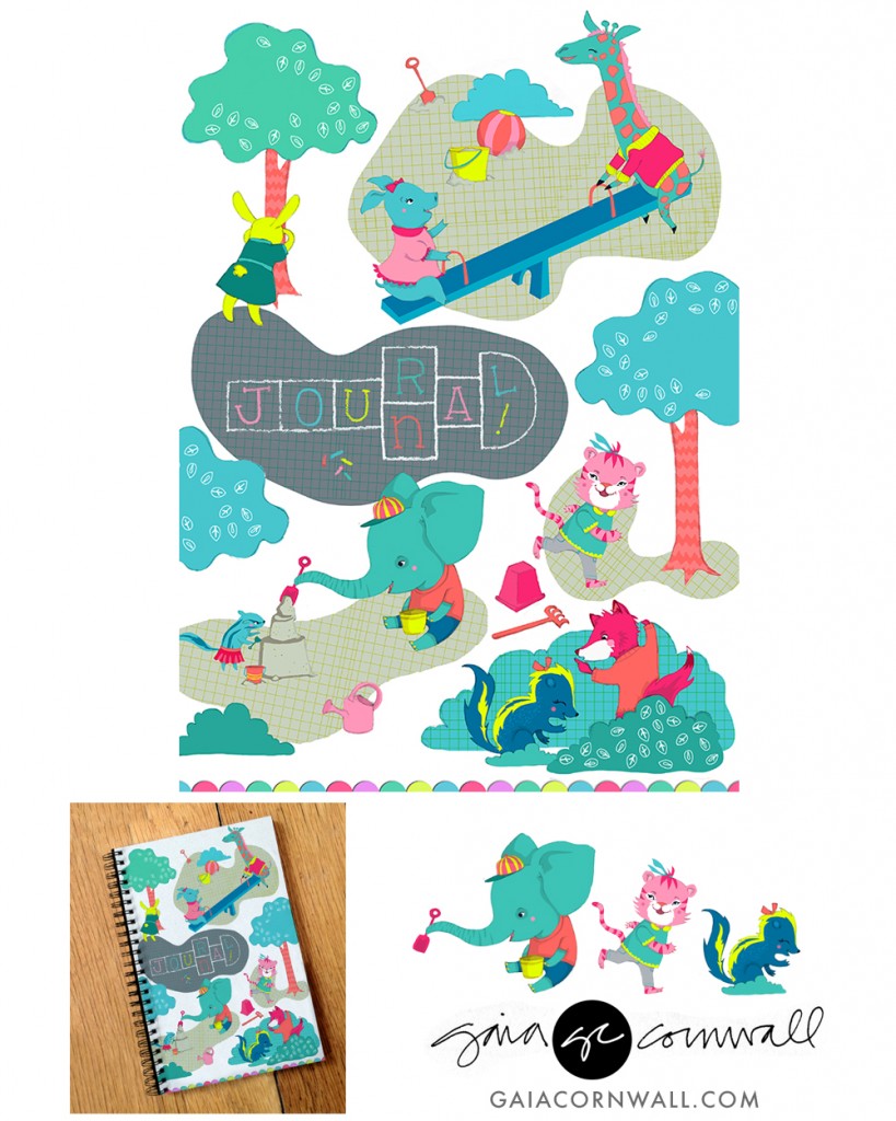
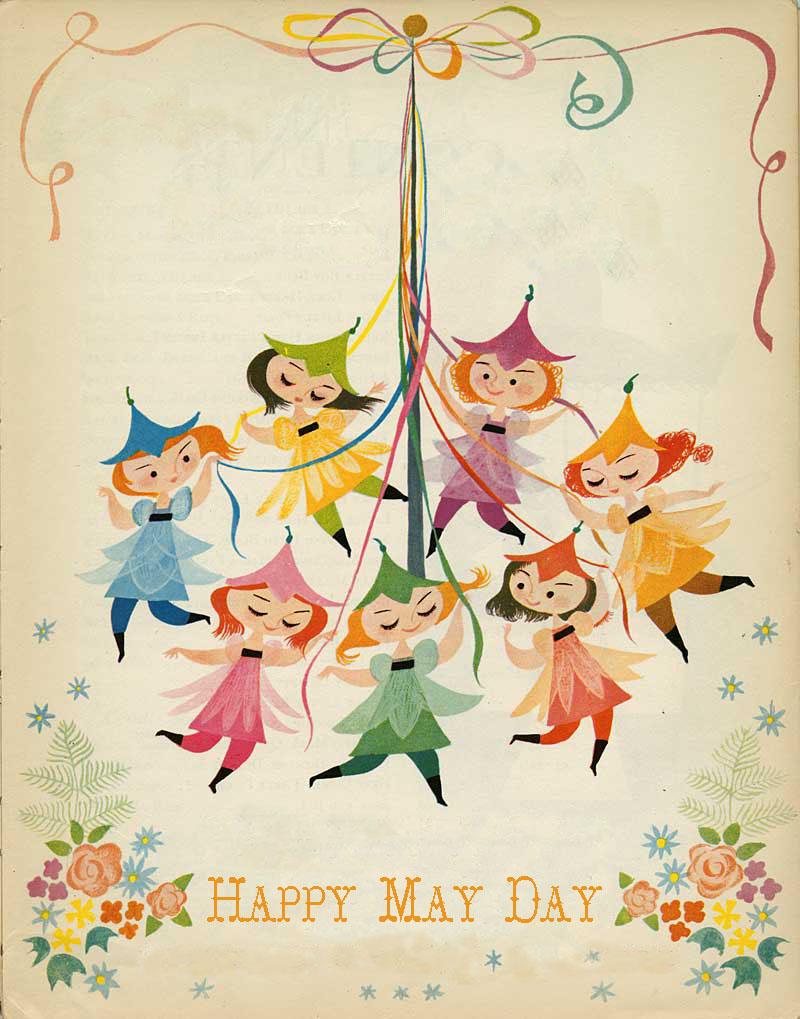
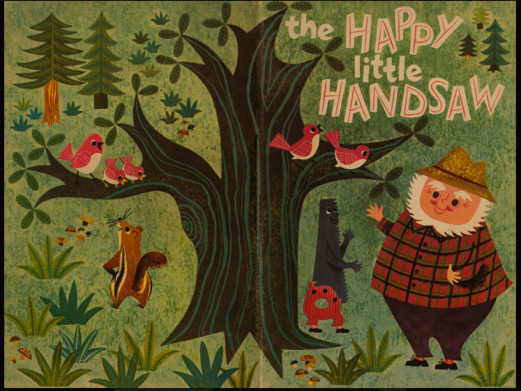
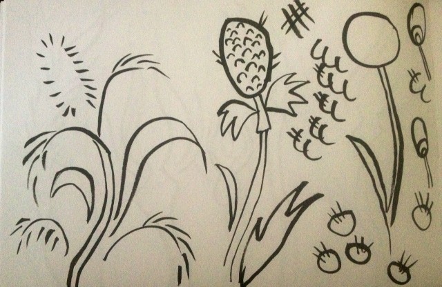
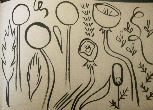
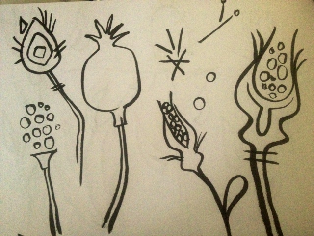
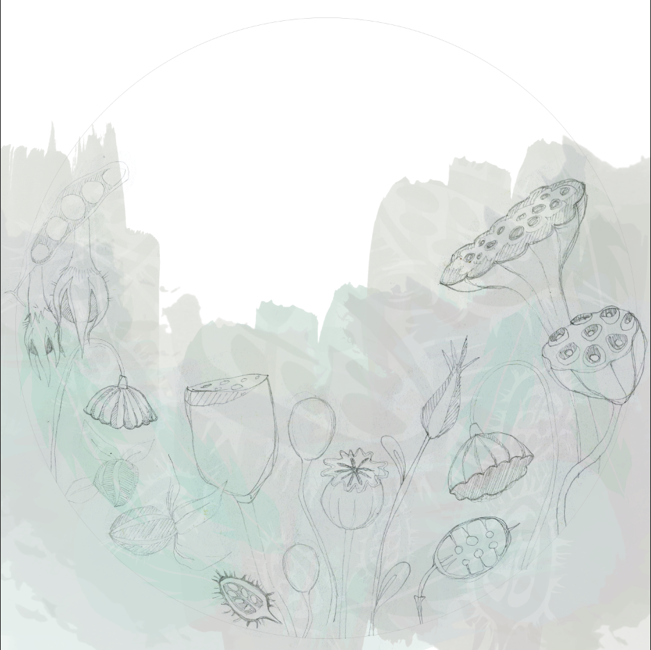
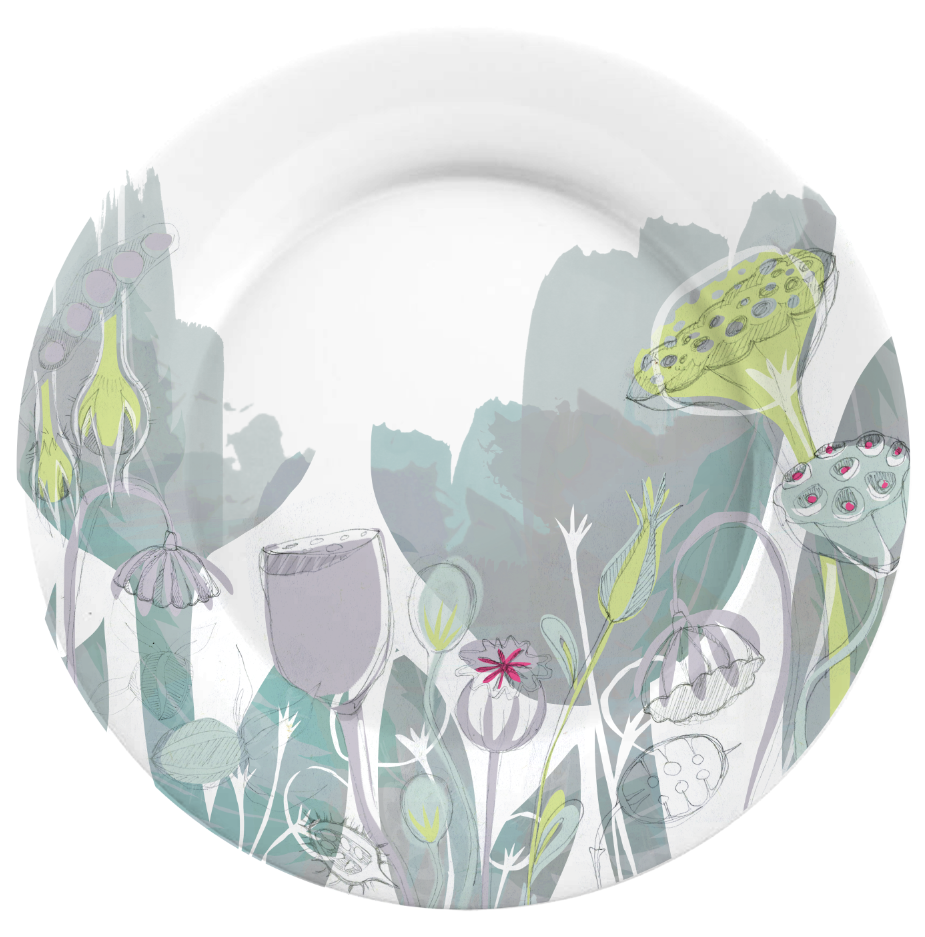
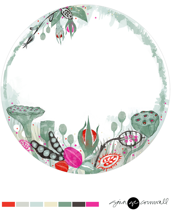
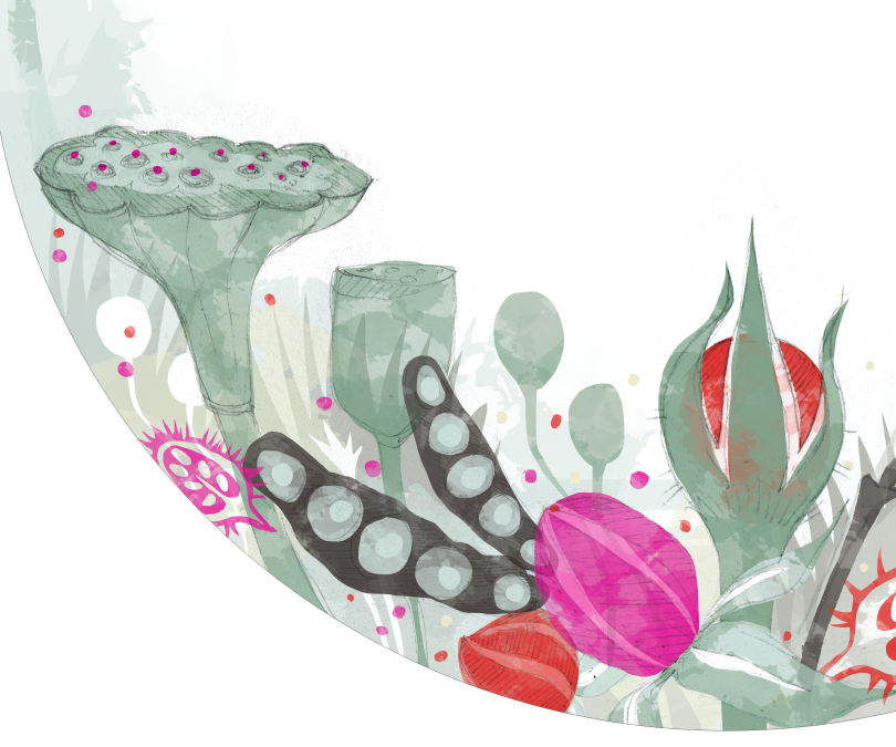
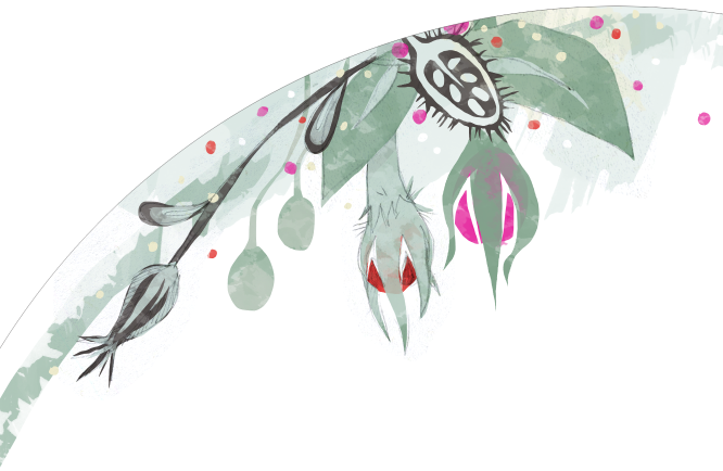
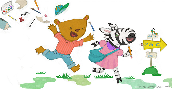
Note: All the art shown here was done during the second half of Lilla's class.
