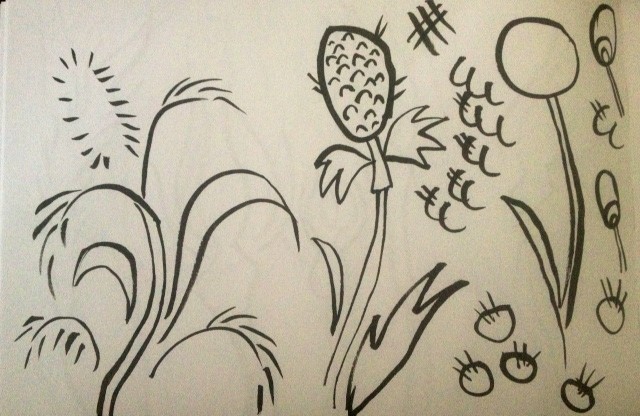
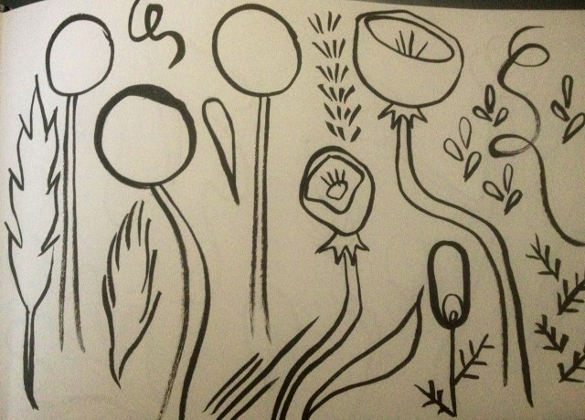
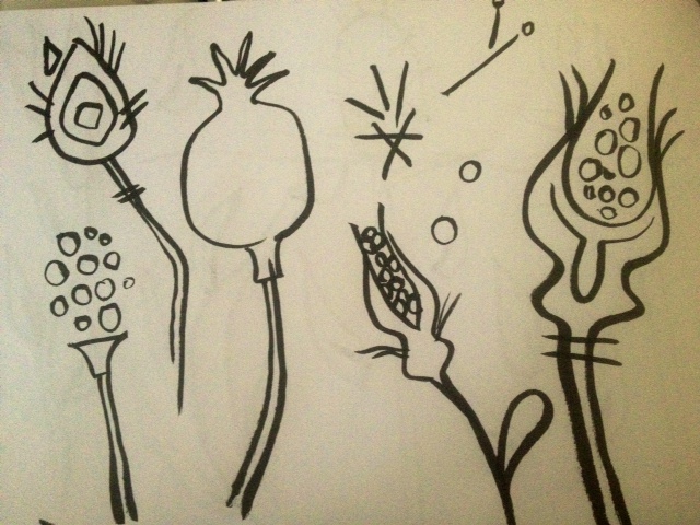
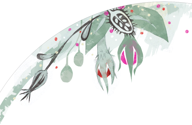
For week 2, the market focus was home decor and our assignment was to design a couple plates that could be used as a collection. I drew lots of pods and "non-traditional" florals, mostly with a brush pen, for the first couple days.
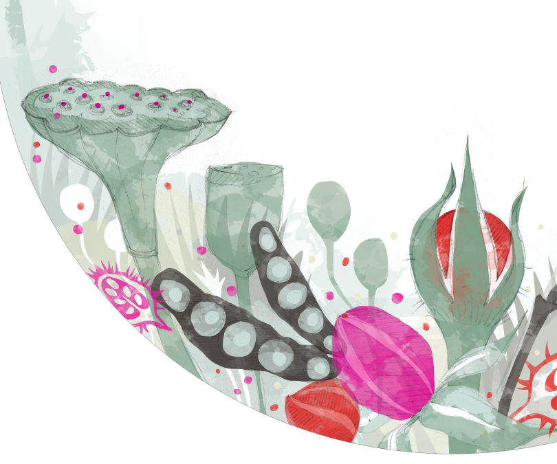
Then, for my final plates, decided to work in "my style"-- pencil drawings, layered in Photoshop, with pops of colors. I don't usually work in this market, so it felt fresh and new to me.
I started out with this:
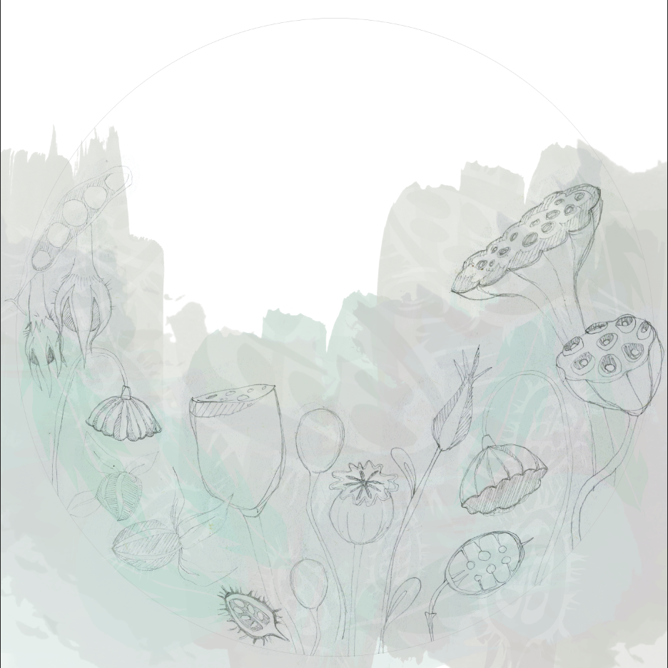
That turned into: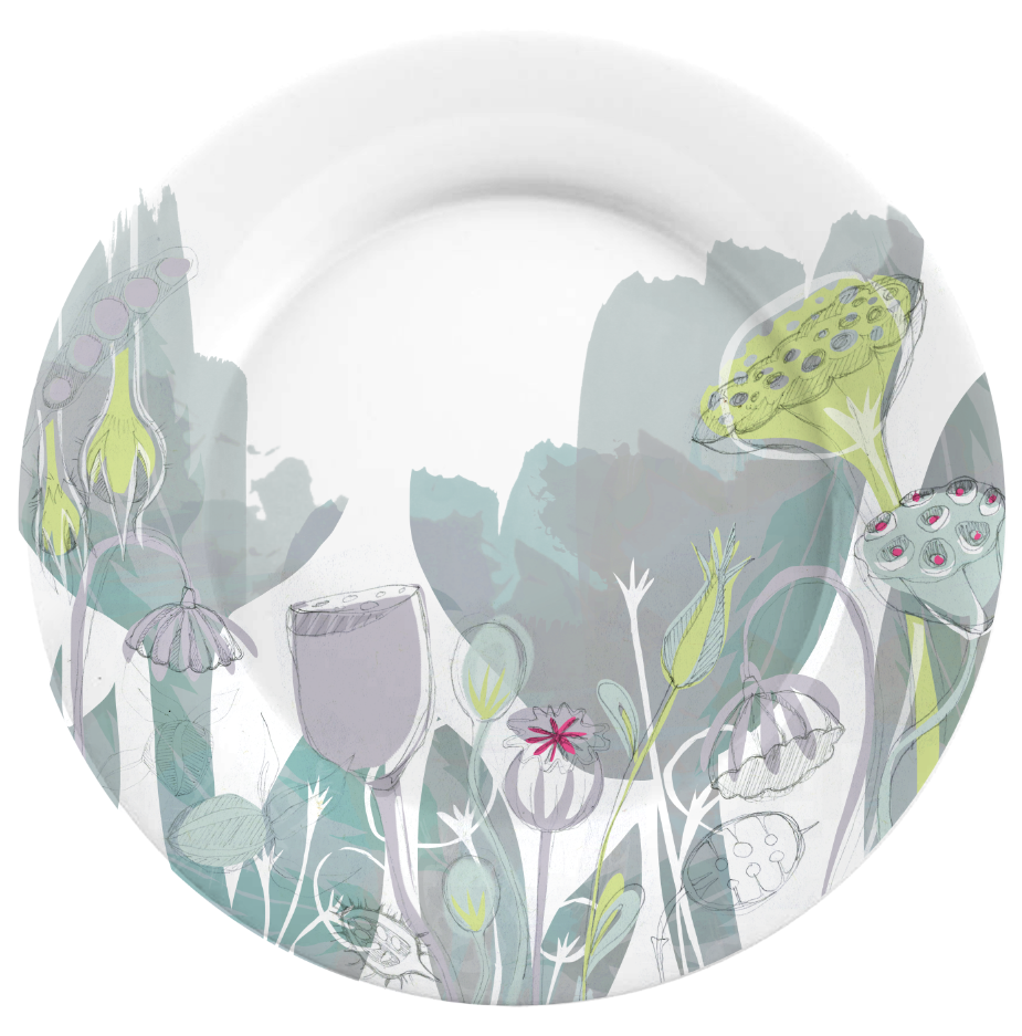
I liked where it was going, but the colors were tripping me up, so I moved on (without finishing it) to what became the design I submitted:
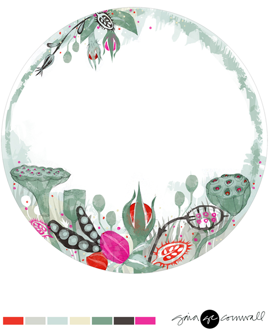
It didn't end up getting chosen for review, but I'm really pleased with how it turned out. The two plates don't quite work together as one collection. But I think if I adjust the colors in the first one, and uh, actually finish the design, they could work together nicely. I'd like to make one more coordinating piece as well.
The biggest thing that stuck with me in Lilla's overall critique of this project last week, was making sure that your design comes across small. Nine times out of ten, the buyer/client will be initially looking at your image in a tiny format-- a thumbnail on your site, or a shop online, a catalog etc. The basic composition has to be be visually interesting and graphic enough to grab them.-- To make them want to see the big version, with all the details.
This sounds obvious to me now, but it caused a huge shift in me. And as much as I love this design, it really isn't all that powerful as a small image. (She suggested we "test" it as 1 inch x 1 inch --the size of a promo button:)

Ironically, the design I started with, has a bit more punch as a small image, due to the large shapes/graphic background. It would have had even more if I had finished it and added in the pink color:
 Anyways, it's something I've been trying to keep in mind ever since.
Children's Books, Week 3 next!

