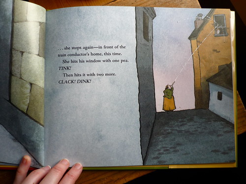
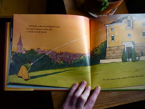
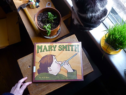
 I'm working on sketches for a book dummy and last week headed to the library for some inspiration. The children's librarian was super nice and helpful-- insisting on finding me every book on my list. I ended up sitting at one of those tiny round tables for an hour paging through picture books piled around me.
One of the comments I received at the picture book workshop was that I should work on including more dynamic compositions. Specifically different points of view, or angles, of a scene. I definitely can get stuck in the medium-wide, straight-on shot and forget about playing with all the other perspectives.
Looking through picture books with a specific element in mind is a fun little exercise I find really helpful. The author and illustrator, Andrea U'Ren, is great at varying the composition on every page of her lovely book Mary Smith. So let's have a look, shall we?
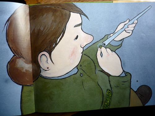
From above, looking down over the shoulder:
(Note the detailed peas in her pocket!)
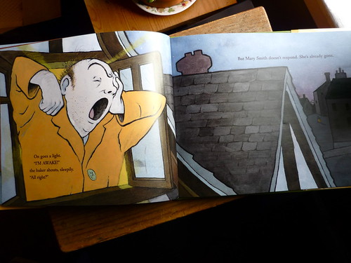
Looking back and down, with a large character in the foreground and a teeny, tiny Mary in the background:
(See her?)
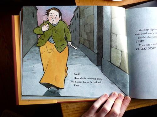
Coming straight at us:
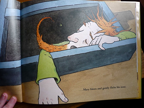
From below, looking up:
Bisecting this wide shot, with the side of the house, gives the reader the feeling of looking down an alley:
I also really like how she illustrates the stories her characters are telling each other with black and white drawings in speech bubbles:
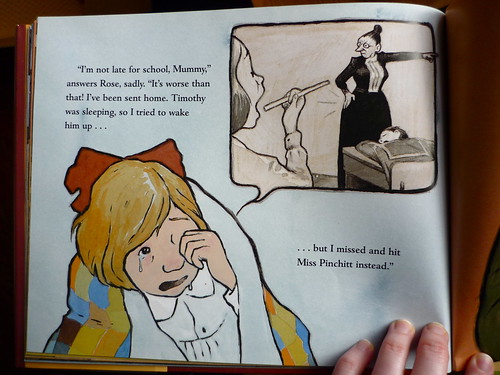
It feels like a fun nod to comics and graphic novels.
And lastly, a wide shot, with Mary in the slight foreground looking back:
While this composition is almost straight on, pushing and pulling the point of view, even minimally, makes a wide shot a bit more interesting. I think its good to remember that the perspective doesn't have to be super dramatic to be more dynamic.
Anyhow, I've been a fan of U'Ren ever since Pugdog was published. I love her thick lines, planes of color, and how all her characters have this great, grounded weight to them. If you haven't already, definitely check her out.

