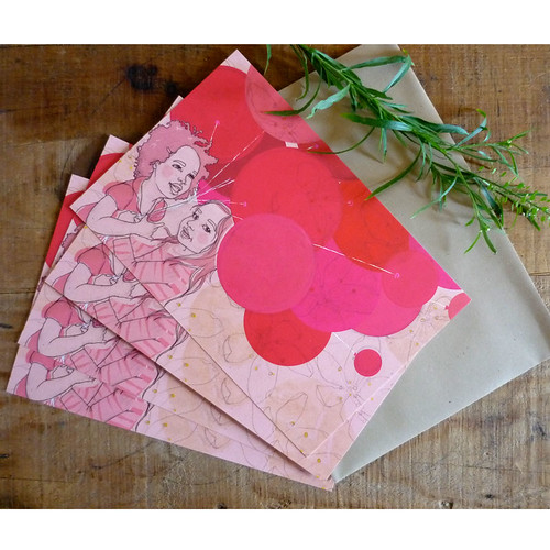
I'm really happy with how these Balloon Cards came out.
 The image is based on a photograph of my friend's daughter. She and her pal were playing in the park under an umbrella. But I decided balloons were more fun to draw. Pop over to the Other Such Things store to check them out.
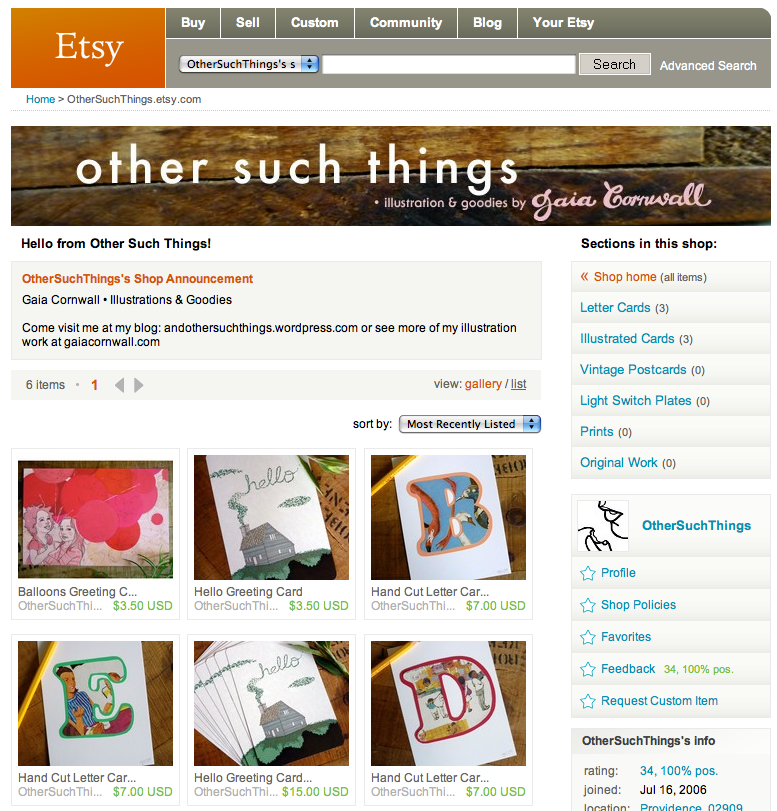
Speaking of, Other Such Things has a new shop banner. I had actually recently updated it, but after reading this article on Mint by Kim Ludy (from the vintage shop Trampoline) about product photos, I decided to rethink things a bit. Kim made some really good points about a shop's visual continuity. I really did like my then-new header, but it didn't make much sense in the theme of the shop really. I think the new header ties in the products wood backgrounds.
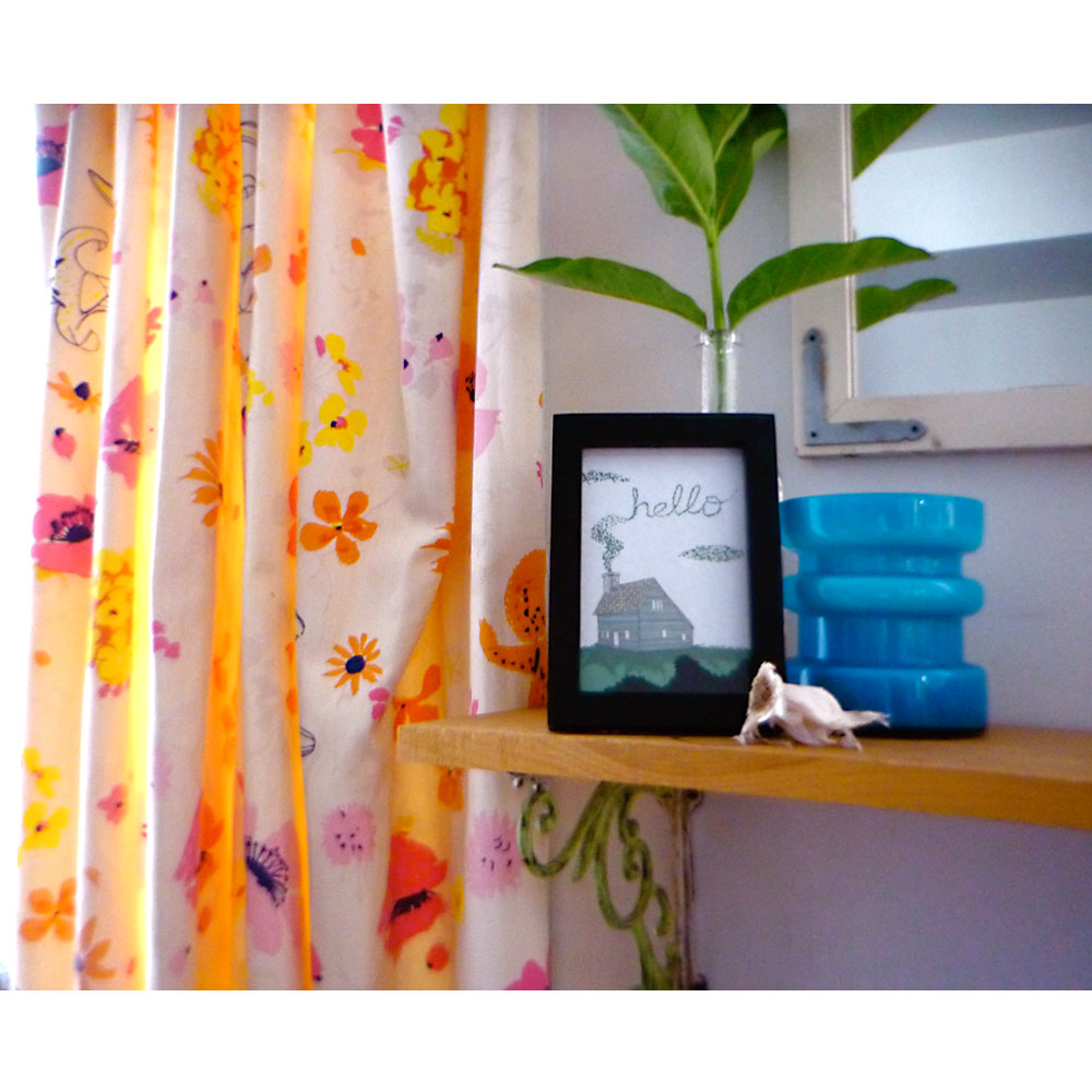
It's simple and clean, which I like as well. I'm not totally in love with it, but its a step in the right direction. I also took new wide shots of the cards. I had this before:
 I like elements of it-- the curtain pattern, that blue and green together-- but again, it doesn't really go with the whole look. So now I have this:
It isn't a perfect solution. I really wanted to show the cards in a frame. --They're postcards, but they look so great framed!-- But its getting closer. If you've got a minute, head on over to Other Such Things and tell me what you think.


